
[PT-BR]
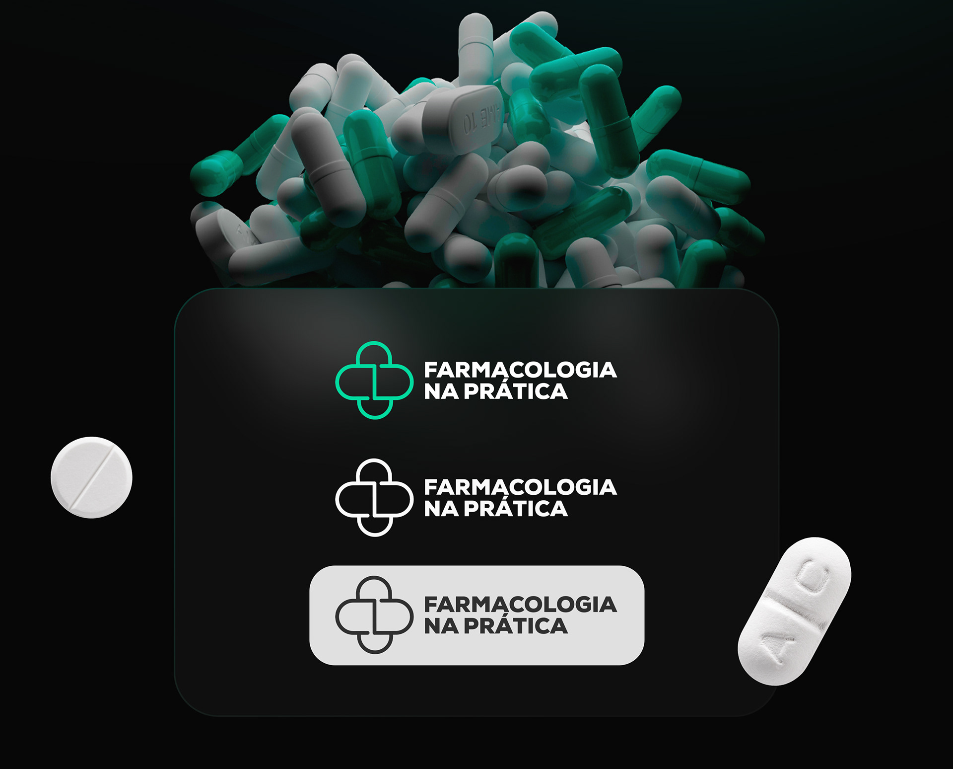
O logotipo foi projetado para ser direto e característico. Ele consiste em duas pílulas de remédio que formam o símbolo da saúde. A tipografia utilizada é concreta, conferindo rigidez à marca.
A logo passou por transformações nos últimos 3 anos, buscando aprimorar seu design e seguir as tendências globais. Durante esse processo, simplificamos o ícone, removendo detalhes e enfatizando linhas mais grossas. Essas mudanças tornaram a logo mais impactante e minimalista, refletindo nossa busca por uma identidade visual moderna e marcante. Estamos orgulhosos do resultado alcançado ao longo desse período de evolução.
[ENG]
The logo was designed to be straightforward and distinctive. It consists of two medicine pills forming the health symbol. The typography used is solid, giving rigidity to the brand.
The logo has undergone transformations over the last 3 years, aiming to improve its design and follow global trends. During this process, we simplified the icon, removing details and emphasizing thicker lines. These changes made the logo more impactful and minimalist, reflecting our pursuit of a modern and striking visual identity. We are proud of the result achieved throughout this period of evolution.

[PT-BR]
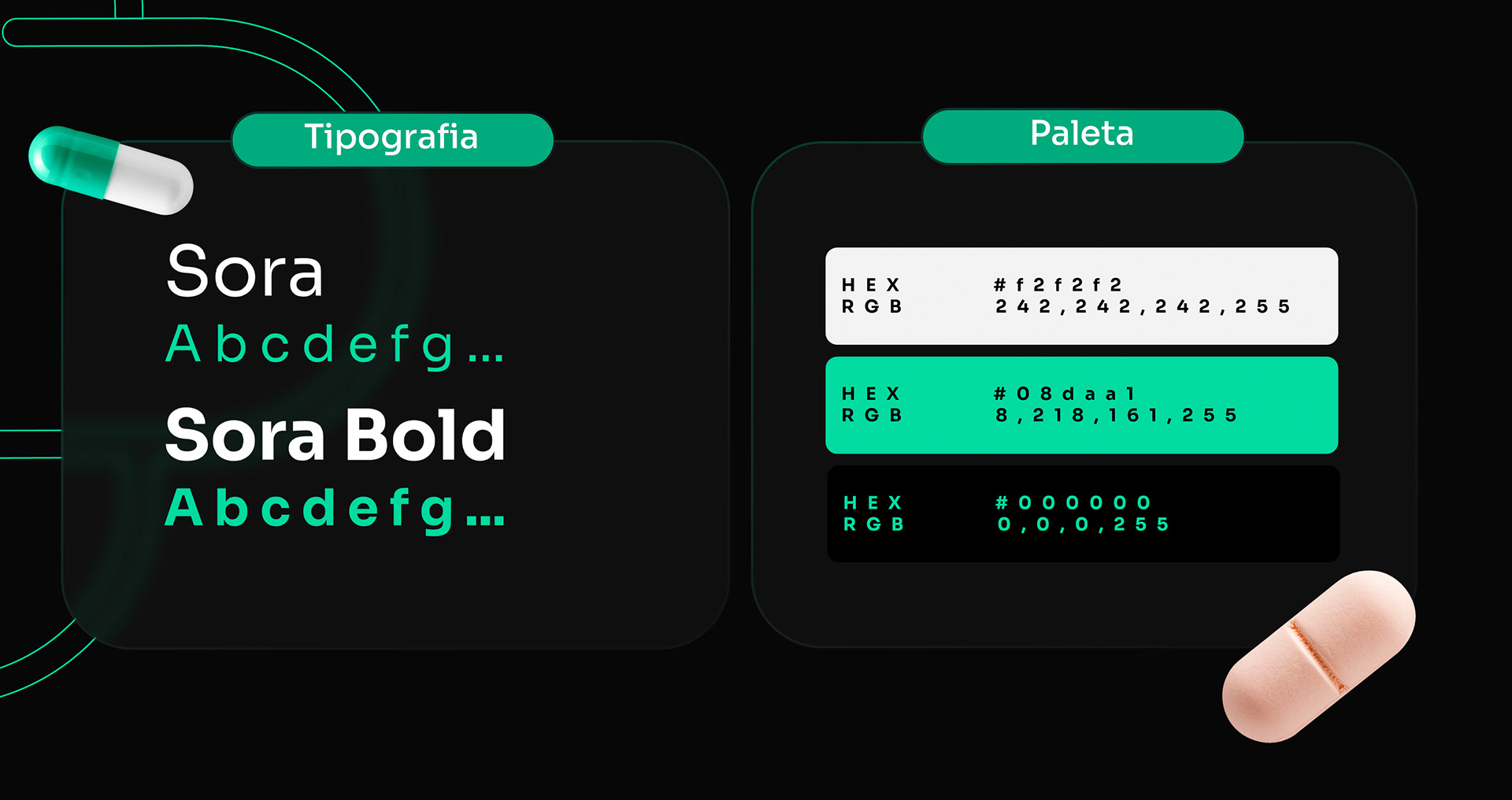
A paleta de cores foi cuidadosamente selecionada para atrair o público-alvo. O tom predominante é um verde claro e neon, que chama a atenção e remete a farmácias e hospitais. Também é permitido o uso do preto e branco, garantindo um bom contraste. É importante ressaltar que a cor oficial da marca é o verde água. A escolha para a tipografia da marca é a família de fontes Sora. Essa família de fontes foi cuidadosamente selecionada para transmitir uma imagem profissional, moderna e legível. Com sua variação de pesos e estilos, a família de fontes Sora oferece flexibilidade e consistência em todas as aplicações da marca.
[ENG]
The color palette has been carefully selected to attract the target audience. The predominant shade is a light and neon green, which grabs attention and is reminiscent of pharmacies and hospitals. Black and white are also allowed, ensuring good contrast. It is important to highlight that the official color of the brand is aqua green. The choice for the brand's typography is the Sora font family. This font family was carefully selected to convey a professional, modern, and readable image. With its range of weights and styles, the Sora font family offers flexibility and consistency across all brand applications.


Obrigado | Thanks!
Siga/Follow: @sercriativo
Animado para trabalhar em algo novo! Se você tem um projeto em mente, basta me enviar uma mensagem no instagram. Vamos fazer coisas incríveis acontecerem juntos.
Excited to work on something new! If you have a project in mind, just send me a message on Instagram. Let's make amazing things happen together.